 It was a great pleasure to make contact with Andrew Haig who shared memories and experiences as a designer. Working with the influential firm Kinneir, Calvert and Tuhilll, he produced the signage for Lancaster West and World's End estates in the 1970s. As artist in residence on Lancaster West in 2015, I had an opportunity to use art to connect residents with the history of their estates; this is a poignant issue as many estates are now under threat from redevelopment schemes as evidenced with Silchester Estate in the same neighbourhood. This blog completes my set of interviews with former architects and current residents of Lancaster West estate.
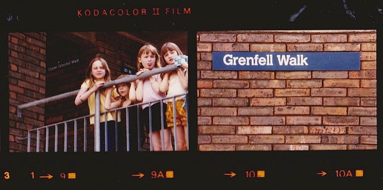
At grammar school in England, my academic career was uneventful. I did well at art and athletics (I still compete today). Politically I was a little right-wing shit and a sergeant major myself in the cadets. At the end of sixth form I applied to join Sandhurst for Officer Training but, influenced by my art master who had been to Reading University, I was persuaded to apply to the only two institutions where you could get a degree in art in those days – Reading and Newcastle. Fortunately I failed the eyesight test at Sandhurst and got accepted at Reading despite my indifferent A level grades (including art!). You needed three A levels for university. UNIVERSITY The four year Honours course with it's academic underpinning suited me fine. The first year was study for the 'First University Exam' in my case in Art, Geography and Ancient History. We then spent time with the main Art sections: Painting, Sculpture and Typography with a view to specialising in the second term of the second year. I realised that much as I enjoyed painting I had no special talent for it and would need, eventually, to make a living. I chose Typography. Good decision. I should say that as soon as I started at Reading I dropped all the right-wing militaristic crap and retreated into a somewhat nihilistic shell. (subsequently I became a community-minded leftie. More of that later). The graphic design profession was only just getting going at that time and despite the dusty academic slant of the course, a bona fide graphic designer was a once-a-week visitor and very influential too. My painting heroes had been Michael Andrews, Richard Diebenkorn and RB Kitaj. Now I started to take an interest in the burgeoning Graphic Design scene in London, particularly the work of those that were serious and analytical. At the very beginning of the fourth year we had to submit an undergraduate dissertation as part of our finals. Mine addressed the ongoing application of a corporate identity for British Rail with a particular look at the signing systems and the emergence generally of lower case sans serif lettering as the standard (yup – pretty nerdy I know but you can see where this is going!). For my research I interviewed several of the key people at British Rail, Design Research Unit and Kinneir Calvert. Jock Kinneir was informative and patient with me when I went to see him at the Royal College of Art where he was head of course. On leaving Reading I interviewed with Kinneir Calvert (Tuhill came several years later) and from my dissertation they could see that I fitted well with their set up and I was offered the job of junior designer. Their office was in Knightsbridge so I started in August 1967 in the heart of 'swinging London'. Bliss! 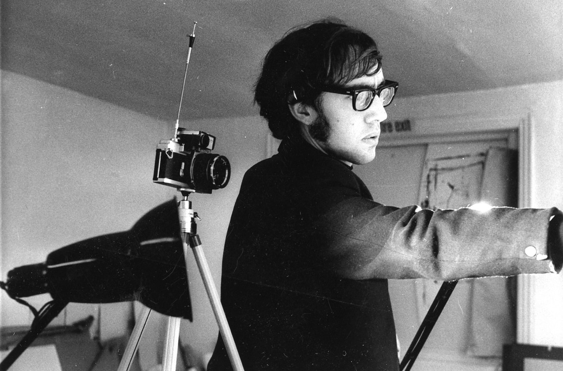 KINNEIR CALVERT (TUHILL) Initially I assisted senior designer David Jones who was working on the signing for the miner's new town in the North East, Silksworth. I helped with the visuals for presentation. Soon I was assisting Margaret Calvert with her airport signing system as well as other more general graphic commissions. I must say that Margaret it is who taught me all there was to know about typography, layout and systematic thinking as well as the thrill of finding the right metonymic image; in graphics a well chosen image or symbol speaks volumes! She was very much a mentor for me. Once a signing scheme was accepted, there was much detail work to be undertaken and I was involved with drawing symbols, doing technical drawing for sign manufacturers and writing and laying out pages of instruction manuals. Meanwhile, I was accepted as a capable typographer and either worked as an assistant in that capacity or otherwise entrusted with the odd annual report or piece of publicity. In those days we still worked largely with hot metal so layouts were traced with precision on typography paper, the compositors instructed and the resultant proofs pasted up as 'artwork'. I loved every moment of it. TEACHING In those days it was considered a matter of status for a young designer to take a day part-time teaching somewhere. In 1970 I started at the London College of Printing on The Diploma in Typographic Design course where I remained for a decade. Jock and Margaret were happy to indulge me. After I went freelance I picked up a second day at Camberwell school of Art 1971-1973. From 1980 to 1986 I taught for two days a week at Middlesex Polytechnic. In each case my speciality was in the basic principles of typography and layout. An underpinning if you like of the work of many a creative student. FREELANCE I turned freelance in July 1971. This was a moment when Jock demonstrated his inherent generosity. I had learned all the essential procedures for devising a signing system and he tasked me with the job of undertaking such a system for the new London Borough of Kensington & Chelsea estates at World's End Chelsea and Lancaster West in Kensington. Initially this involved pouring over architect's maps and, indeed, talking to them when necessary. I also met them frequently on site and determined the routes through the development and each point of decision. The job involved not just the signing but given the complexity of horizontal and vertical streets intersecting, working out the most efficient addressing system for the benefit of the postmen as much as residents. An analysis of this hugely complex task was written by me. It was accompanied by display boards which Jock and I presented to a huge planning committee at Kensington and Chelsea. Using Margaret's slab serif update of her Rail alphabet, the job involved tracing each and every sign onto sheets to be supplied to the sign manufacturers in dyeline form. Margaret's alphabet eventually became formalised as the typeface called Calvert and to this day is used for the signs of the Newcastle underground system. The dyelines would have been backed up with precise technical specifications. The lettering would always have been accurate courtesy of Margaret's tiling system where artwork was pasted up from lettering printed on paper with each letter on a 'tile' to distance it accurately from its neighbour. I have located some reference photography (1976) of a few of the signs in situ. The blue signs at Lancaster West and the brown ones at World's End, including the large 3D floor numbers that Margaret designed; not sure why she thinks the scheme was not implemented, these shots seem to prove otherwise. (3d signs were only installed at World's End estate, but now not in evidence - Constantine's comment) Note that our signs took due note of horizontal and vertical brick intervals and used those as sign size determinants. One decision we made and justified at the time was my idea to, instead of using arrows, use words (left, right, upstairs etc). Forty five years later it seems just plain wrong. Not everyone reads English or reads it well. What's wrong with good old arrows? 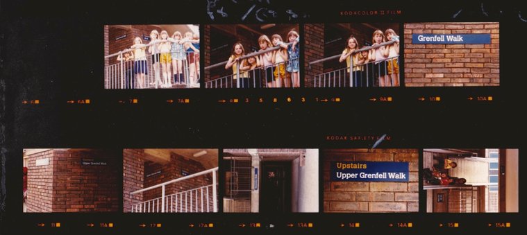 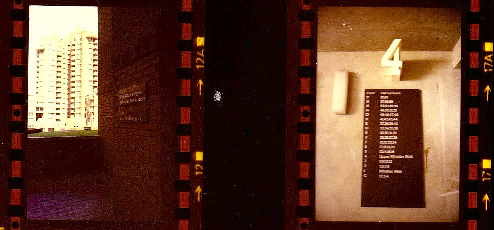 All photos courtesy of Andrew Haig.
SUBSEQUENTLY I continued with teaching and freelance work specialising in non-commercial clients such as charities and public bodies. For several years in the eighties I shared studio space in Islington just down the road from the GLC Learning Materials Service for whom I did a considerable amount of work. In the mid seventies I had bought a house in Graham Road Hackney (I had to take a full time job for a year as studio manager with Tauber-Fandora Colour Printers – impossible to get a mortgage as a free lancer in those days!). It became obvious that the GLC were planning to formalise our street as an HGV route through from the Blackwall Tunnel to Archway. Along with some neighbours I formed the Graham Road Neighbourhood Group which became a really influential force in the area. I was its first chairman. We did a considerable amount of lobbying and even direct action. We used to do 'zebra walks' back and forth across the road – 70 or so residents, old and young, at 7 o'clock in the morning. This is where I start to connect with your residents! In 1993 I moved to Brighton where I set up a freelance design "collective" working still for the non-commercial sector. In 2009 I retired and still now am involved with my community but otherwise enjoying getting back to my own creativity. I paint and write short stories and poetry which I self-publish. I am also a heavily involved with a local running club for whom I compete frequently – now in the 70 category!
0 Comments
Leave a Reply. |
Categories
All
Archives
May 2024
|
 RSS Feed
