|
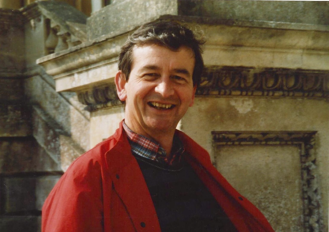
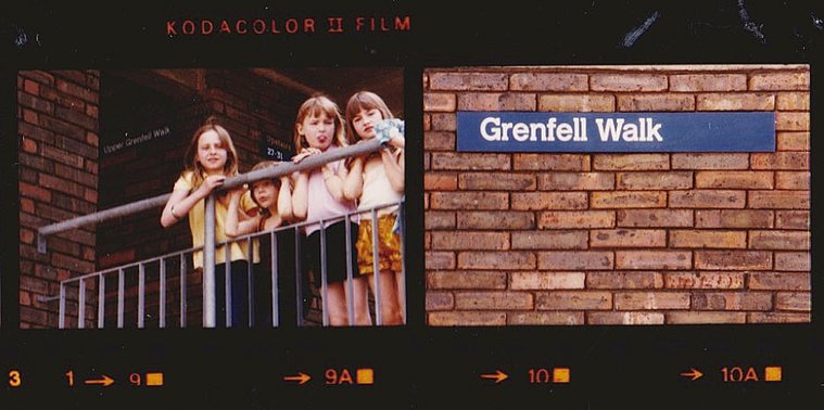
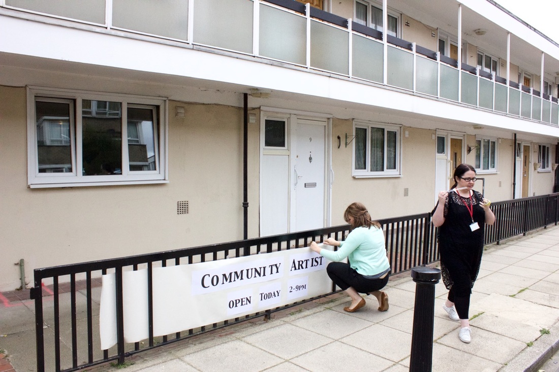
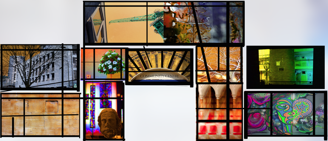
Obituary for Nigel Whitbread (1938-2019) Modest, talented architect with a passion for walking, travel and sports cars Nigel Whitbread was born in Kenton near Harrow. His parents had a grocer’s on St Helen’s Gardens in North Kensington and the family moved in 1949 to be nearer the shop. That was Nigel’s home from the age of ten to his death. After attending Sloane Grammar School, Nigel joined the firm of Clifford Tee and Gale where he served his apprenticeship demonstrating a great talent for drawing for which he became renowned and which he taught later on. He went one day a week plus night school to the Hammersmith School of Art and Building. Subsequent to this he became a member of the Royal Institute of British Architects. But it was Nigel’s time at Douglas Stephen and Partners that was the most influential time in his career. It was a small practice, but doing important things and at the forefront of design influenced by Le Corbusier and other modernists. It was there that Nigel worked with architects from the Architectural Association and the Regent Street Polytechnic: Kenneth Frampton who was the Technical Editor of the journal Architectural Design; and Elia and Zoe Zenghelis and Bob Maxwell who both spent most of their careers in the teaching world. Nigel remarked that it was like going to a club with the bonus of doing terrific work. In the early 1970s Nigel went to work with Clifford Wearden and Associates on Lancaster West Estate. It was a huge job for a small group and unusual for councils to use private architects in those days. The whole scheme had been well prepared by the time Nigel joined to lead the team in designing Grenfell Tower. While a lot of brick had been used in LCC and GLC buildings, he thought that putting bricks one on top of the other for twenty storeys was a crazy thing to do. So insulated pre-cast concrete beams as external walls, were lifted up and put into place with cranes. The concrete columns and slabs and pre-cast beams, all holding the building together, were also designed in response to Ronan Point, the tower that partially collapsed in 1968. Nigel remarked that he could see the tower standing in 100 years time. In 2016, Nigel visited Grenfell Tower at my invitation, when I was community artist in residence. He visited residents in their flats for the first time and enjoyed hearing how they viewed the spacious flats (built to Parker Morris Standards) and the stunning views. It is impossible to know the sadness and anger he must have felt as he witnessed the tragic fire that occurred on 14 June, 2017. Nigel retired after working at Aukett Associates for 30 years. His projects included the Landis and Gyr factory North Acton and Marks and Spencer's Management Centre Chester: two award winning buildings he co-designed. As a director of the practice, he had a lot of responsibility, but spent time mentoring younger architects. Nigel was happy in his retirement and in his travels over many years, including recent trips to India, the Himalayas and Colombia. He continued to use his skills in helping his local resident’s association draw up the St Quintin and Woodlands Neighbourhood Plan which was accepted by the local authority under the Localism Act. He will be remembered by his friends and family as a dignified, humorous, generous and inspirational man. Silchester and Lancaster West Estate Open Garden Estate Weekend, June 2016
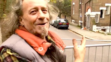
Here's a link to an interview with Nigel and the other architects of Lancaster West Estate.
6 Comments
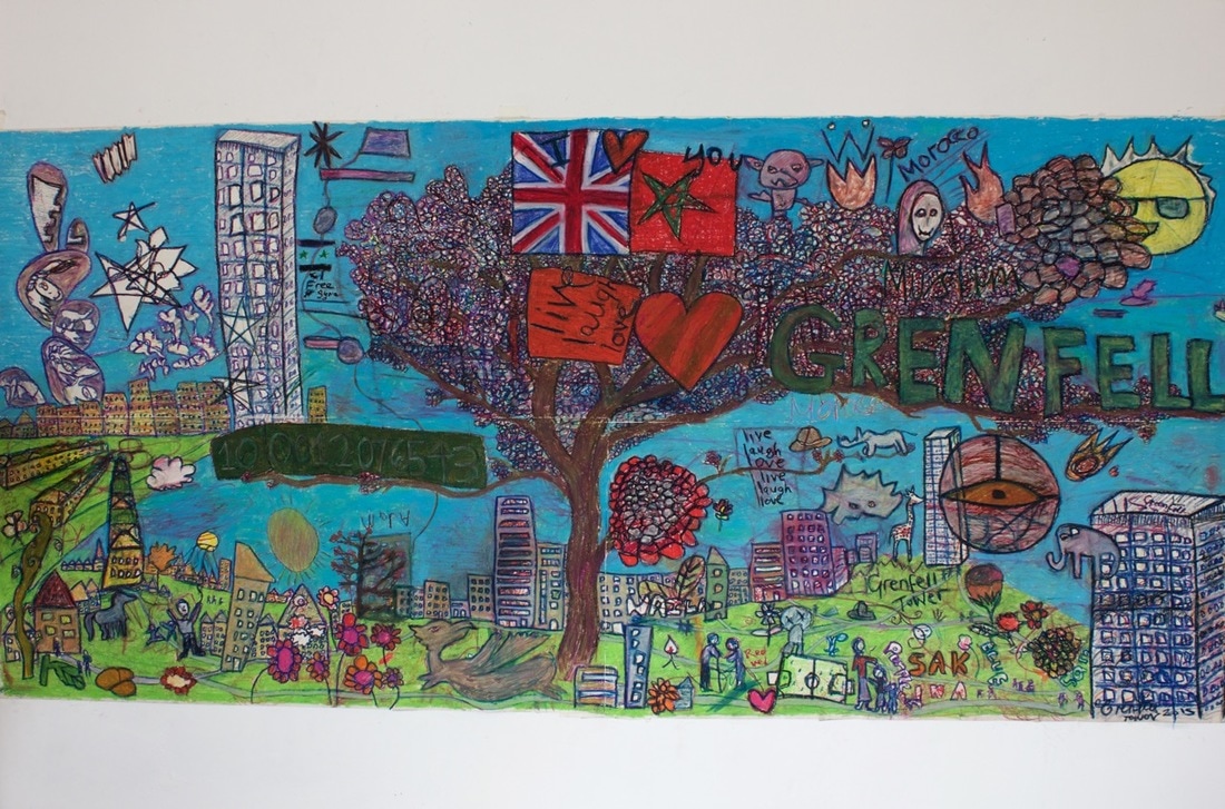
It was a great pleasure to make contact with Andrew Haig who shared memories and experiences as a designer. Working with the influential firm Kinneir, Calvert and Tuhilll, he produced the signage for Lancaster West and World's End estates in the 1970s. As artist in residence on Lancaster West in 2015, I had an opportunity to use art to connect residents with the history of their estates; this is a poignant issue as many estates are now under threat from redevelopment schemes as evidenced with Silchester Estate in the same neighbourhood. This blog completes my set of interviews with former architects and current residents of Lancaster West estate.
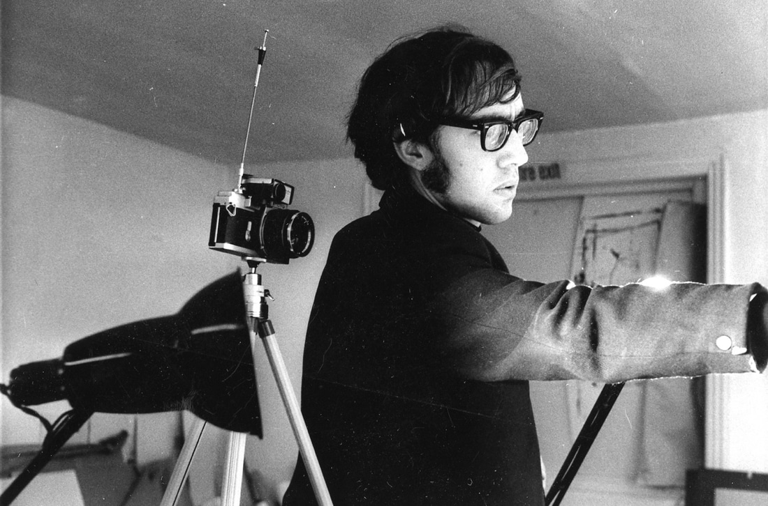
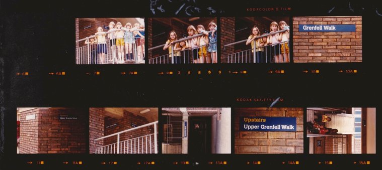
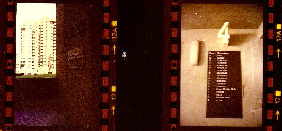
At grammar school in England, my academic career was uneventful. I did well at art and athletics (I still compete today). Politically I was a little right-wing shit and a sergeant major myself in the cadets. At the end of sixth form I applied to join Sandhurst for Officer Training but, influenced by my art master who had been to Reading University, I was persuaded to apply to the only two institutions where you could get a degree in art in those days – Reading and Newcastle. Fortunately I failed the eyesight test at Sandhurst and got accepted at Reading despite my indifferent A level grades (including art!). You needed three A levels for university. UNIVERSITY The four year Honours course with it's academic underpinning suited me fine. The first year was study for the 'First University Exam' in my case in Art, Geography and Ancient History. We then spent time with the main Art sections: Painting, Sculpture and Typography with a view to specialising in the second term of the second year. I realised that much as I enjoyed painting I had no special talent for it and would need, eventually, to make a living. I chose Typography. Good decision. I should say that as soon as I started at Reading I dropped all the right-wing militaristic crap and retreated into a somewhat nihilistic shell. (subsequently I became a community-minded leftie. More of that later). The graphic design profession was only just getting going at that time and despite the dusty academic slant of the course, a bona fide graphic designer was a once-a-week visitor and very influential too. My painting heroes had been Michael Andrews, Richard Diebenkorn and RB Kitaj. Now I started to take an interest in the burgeoning Graphic Design scene in London, particularly the work of those that were serious and analytical. At the very beginning of the fourth year we had to submit an undergraduate dissertation as part of our finals. Mine addressed the ongoing application of a corporate identity for British Rail with a particular look at the signing systems and the emergence generally of lower case sans serif lettering as the standard (yup – pretty nerdy I know but you can see where this is going!). For my research I interviewed several of the key people at British Rail, Design Research Unit and Kinneir Calvert. Jock Kinneir was informative and patient with me when I went to see him at the Royal College of Art where he was head of course. On leaving Reading I interviewed with Kinneir Calvert (Tuhill came several years later) and from my dissertation they could see that I fitted well with their set up and I was offered the job of junior designer. Their office was in Knightsbridge so I started in August 1967 in the heart of 'swinging London'. Bliss! KINNEIR CALVERT (TUHILL) Initially I assisted senior designer David Jones who was working on the signing for the miner's new town in the North East, Silksworth. I helped with the visuals for presentation. Soon I was assisting Margaret Calvert with her airport signing system as well as other more general graphic commissions. I must say that Margaret it is who taught me all there was to know about typography, layout and systematic thinking as well as the thrill of finding the right metonymic image; in graphics a well chosen image or symbol speaks volumes! She was very much a mentor for me. Once a signing scheme was accepted, there was much detail work to be undertaken and I was involved with drawing symbols, doing technical drawing for sign manufacturers and writing and laying out pages of instruction manuals. Meanwhile, I was accepted as a capable typographer and either worked as an assistant in that capacity or otherwise entrusted with the odd annual report or piece of publicity. In those days we still worked largely with hot metal so layouts were traced with precision on typography paper, the compositors instructed and the resultant proofs pasted up as 'artwork'. I loved every moment of it. TEACHING In those days it was considered a matter of status for a young designer to take a day part-time teaching somewhere. In 1970 I started at the London College of Printing on The Diploma in Typographic Design course where I remained for a decade. Jock and Margaret were happy to indulge me. After I went freelance I picked up a second day at Camberwell school of Art 1971-1973. From 1980 to 1986 I taught for two days a week at Middlesex Polytechnic. In each case my speciality was in the basic principles of typography and layout. An underpinning if you like of the work of many a creative student. FREELANCE I turned freelance in July 1971. This was a moment when Jock demonstrated his inherent generosity. I had learned all the essential procedures for devising a signing system and he tasked me with the job of undertaking such a system for the new London Borough of Kensington & Chelsea estates at World's End Chelsea and Lancaster West in Kensington. Initially this involved pouring over architect's maps and, indeed, talking to them when necessary. I also met them frequently on site and determined the routes through the development and each point of decision. The job involved not just the signing but given the complexity of horizontal and vertical streets intersecting, working out the most efficient addressing system for the benefit of the postmen as much as residents. An analysis of this hugely complex task was written by me. It was accompanied by display boards which Jock and I presented to a huge planning committee at Kensington and Chelsea. Using Margaret's slab serif update of her Rail alphabet, the job involved tracing each and every sign onto sheets to be supplied to the sign manufacturers in dyeline form. Margaret's alphabet eventually became formalised as the typeface called Calvert and to this day is used for the signs of the Newcastle underground system. The dyelines would have been backed up with precise technical specifications. The lettering would always have been accurate courtesy of Margaret's tiling system where artwork was pasted up from lettering printed on paper with each letter on a 'tile' to distance it accurately from its neighbour. I have located some reference photography (1976) of a few of the signs in situ. The blue signs at Lancaster West and the brown ones at World's End, including the large 3D floor numbers that Margaret designed; not sure why she thinks the scheme was not implemented, these shots seem to prove otherwise. (3d signs were only installed at World's End estate, but now not in evidence - Constantine's comment) Note that our signs took due note of horizontal and vertical brick intervals and used those as sign size determinants. One decision we made and justified at the time was my idea to, instead of using arrows, use words (left, right, upstairs etc). Forty five years later it seems just plain wrong. Not everyone reads English or reads it well. What's wrong with good old arrows?
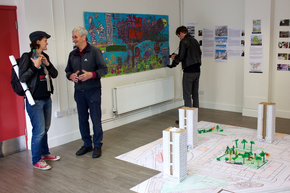
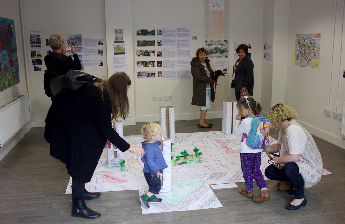
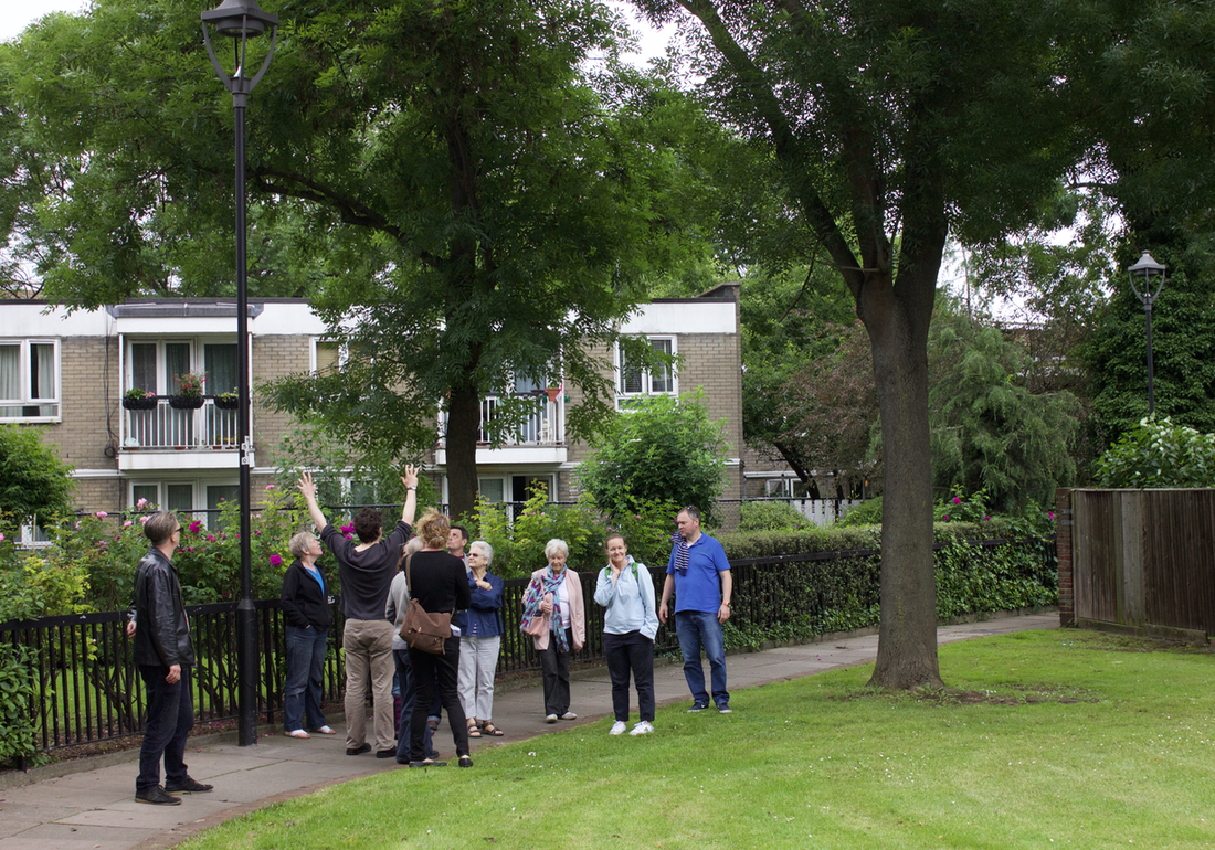
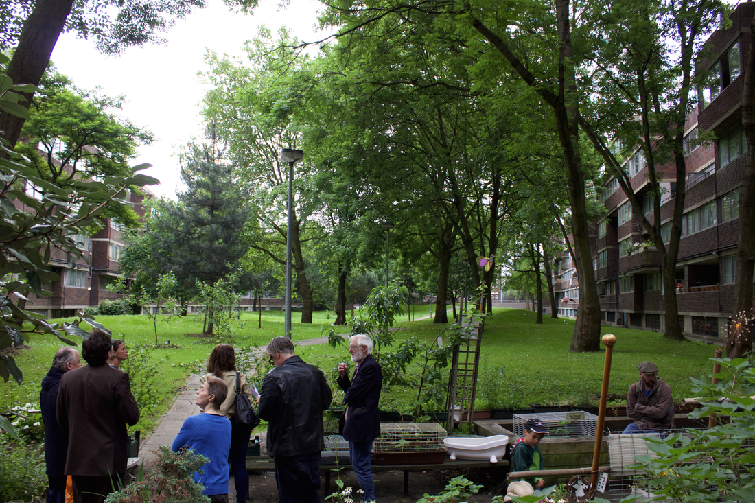
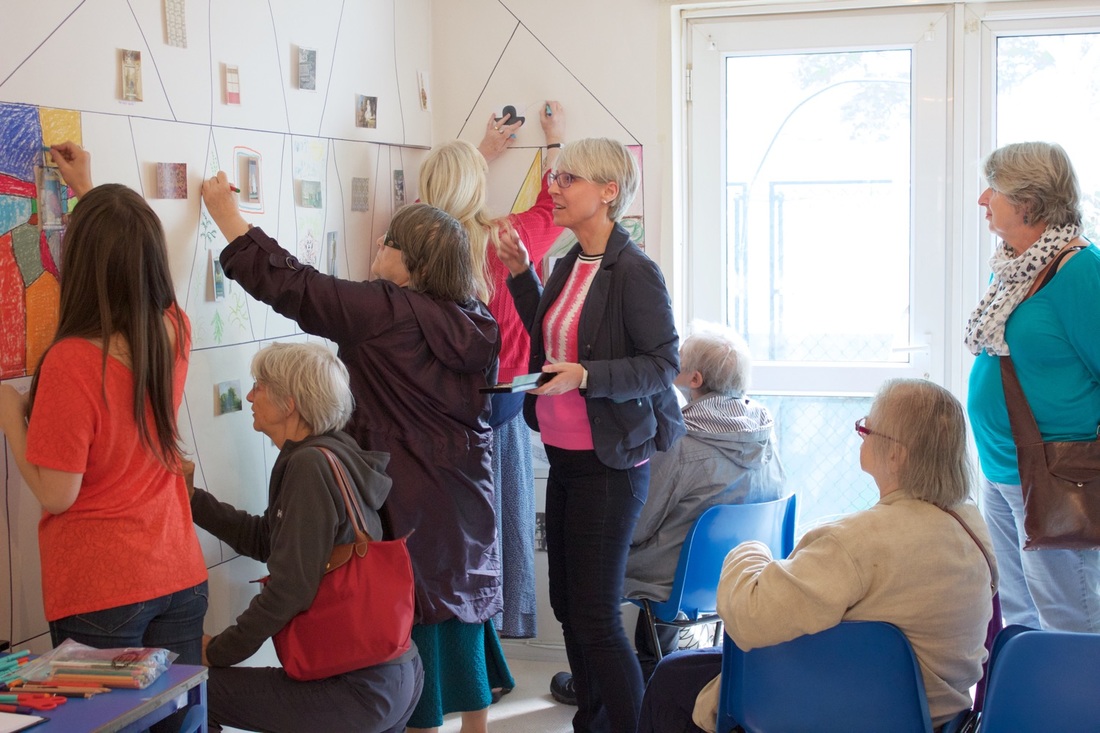
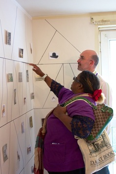
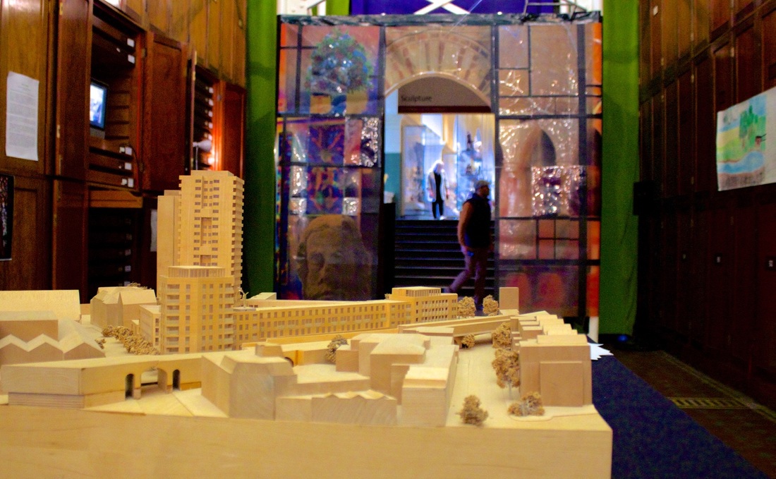
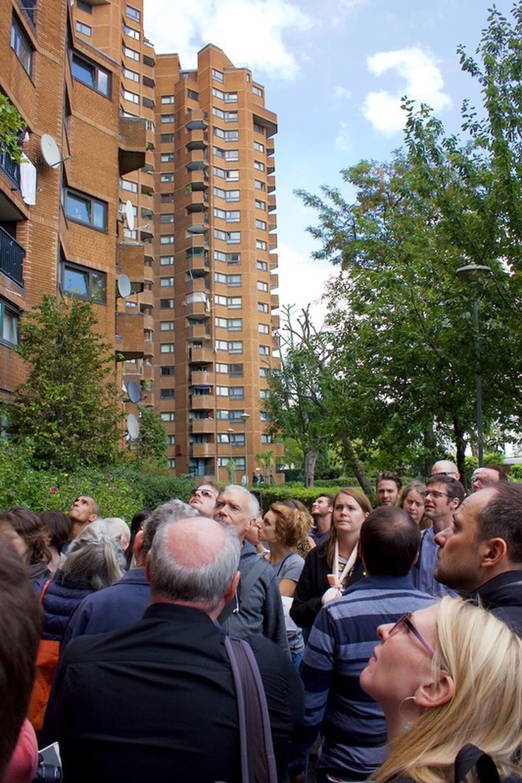
SUBSEQUENTLY I continued with teaching and freelance work specialising in non-commercial clients such as charities and public bodies. For several years in the eighties I shared studio space in Islington just down the road from the GLC Learning Materials Service for whom I did a considerable amount of work. In the mid seventies I had bought a house in Graham Road Hackney (I had to take a full time job for a year as studio manager with Tauber-Fandora Colour Printers – impossible to get a mortgage as a free lancer in those days!). It became obvious that the GLC were planning to formalise our street as an HGV route through from the Blackwall Tunnel to Archway. Along with some neighbours I formed the Graham Road Neighbourhood Group which became a really influential force in the area. I was its first chairman. We did a considerable amount of lobbying and even direct action. We used to do 'zebra walks' back and forth across the road – 70 or so residents, old and young, at 7 o'clock in the morning. This is where I start to connect with your residents! In 1993 I moved to Brighton where I set up a freelance design "collective" working still for the non-commercial sector. In 2009 I retired and still now am involved with my community but otherwise enjoying getting back to my own creativity. I paint and write short stories and poetry which I self-publish. I am also a heavily involved with a local running club for whom I compete frequently – now in the 70 category! Here's a recap of the Open Garden estate weekend that was organised by Silchester Residents Association and Constantine Gras. It had funding and support from Architects for Social Housing, RBKC council and InTRANSIT festival of arts. The event took place on Saturday 18 and Sunday 19 JUNE 2016. The aim was to celebrate community and cultural life, architecture and garden spaces at both Silchester and Lancaster West estate. The former estate is being considered for regeneration by RBKC council. Centre stage was a 1:100 scale model of Silchester estate made by Michael Jardine, Nahid Ashby and Constantine Gras. This was a wonderful way of visualising the estate and the potential impacts of regeneration. In addition to art made by residents, we had a film programme and guided walks. The walks connected the older sister estate of Silchester with its younger brother, Lancaster West, which lies on the other side of the Bramley Road. Residents, Michael Jardine and Piers Thompson lead us from the elegance of Waynflete Square to the more private spaces of Lancaster West; the latter was designed by landscape architect, Michael Brown.
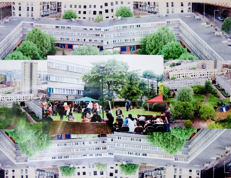
Photo collage by James Mercer, Resident of Waynflete Square
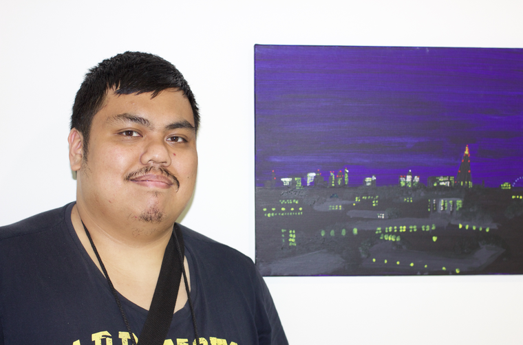
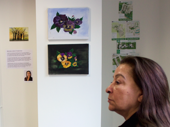
I have lived on Shalfleet Drive for 7 years. From our bedroom windows we have a nice view onto Wayneflete Square which is a nice well kept estate. I love art, I always have. It seems to relax me and gives me a way to express myself. I mainly do illustrative art, like cartoons, animation. To quote my art teacher I am a "Perfectionist with a pencil”. Lex Quiambao, resident of Whitstable House I’m a freelance Artist and a waiter working at a pub. I also do volunteering at the youth club. I like to paint at home. These two paintings are views from my balcony on the 11th floor. It’s a landscape of London from day to night showing how light and time both changes and grows.
Nahid Ashby, resident of Frinstead House
I was born in Iran and I came here just for the summer holidays in 1970. I loved the freedom and that’s why I stayed. When I first moved to Frinstead House in about 1980. I thought, Oh my God! I probably can’t stay here. But the flats are pretty comfortable. Waynflete square, with its low rise buildings and small delightful gardens full of trees, shrubs and scented flowers, has a special place in my daily walk. I particularly like this area because it has a wide view of the sky and the beautiful sunset colours that melt my heart. I use these trees, sky and shapes in many of my paintings.
Derek White, Shalfleet Drive Leaseholder
I have lived on the estate for eight years with my wife and am proud to have been Chair of the Silchester Residents' Association since 2011. My hope and belief is that by doing what I am good at, I enable others to do what they are good at. Our community of Silchester Estate is diverse and friendly with a mix of long standing and more recent residents. I am shocked by the possible plans that the Council has for our area as they do not seem to take account of what is here already, but I am encouraged by the way the community has come out and met together, shared views and supported each other and I firmly believe that it is that strength that will enable us to play a part in continuing to build community. I was privileged to speak at the Cabinet Meeting on 26th May where the Cabinet decided to proceed with further options in the Feasibility Study and committed to working with the RA as a significant partner.
Mary White, Shalfleet Drive Leaseholder
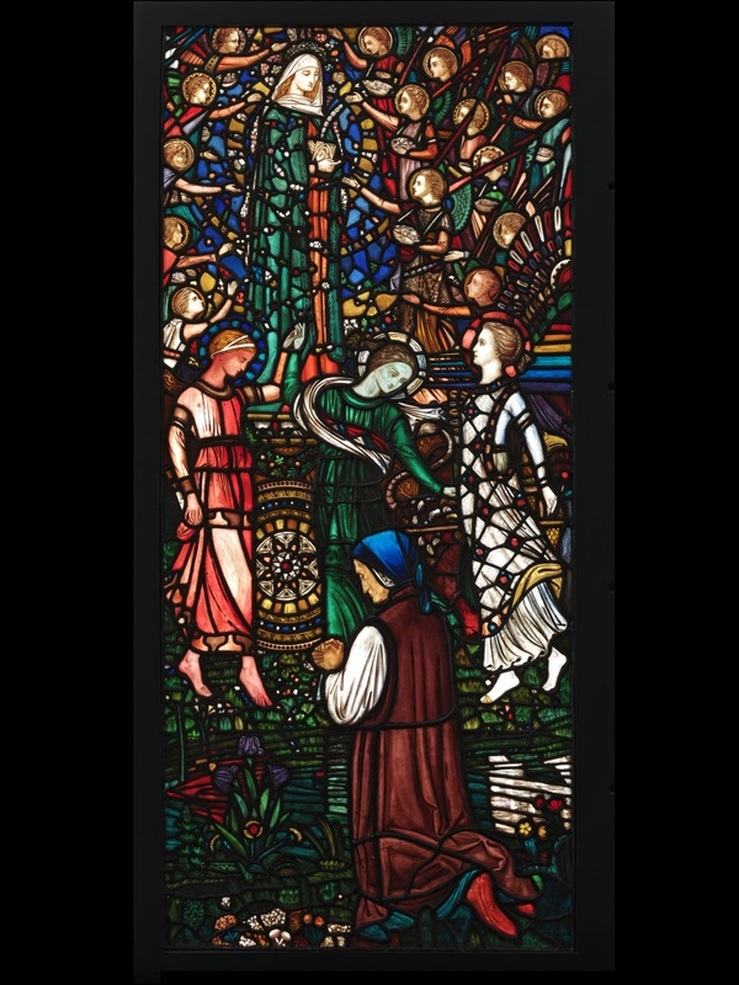
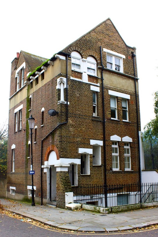
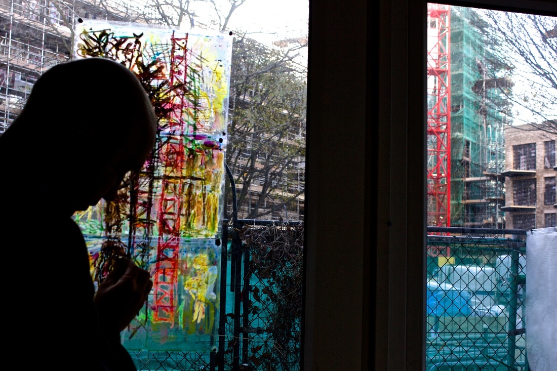
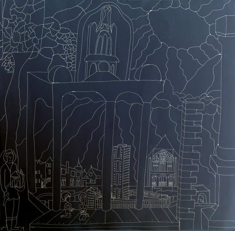
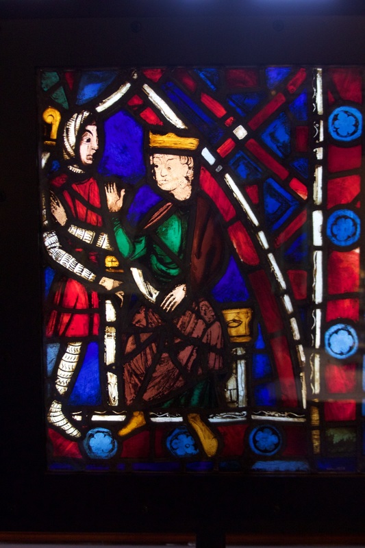
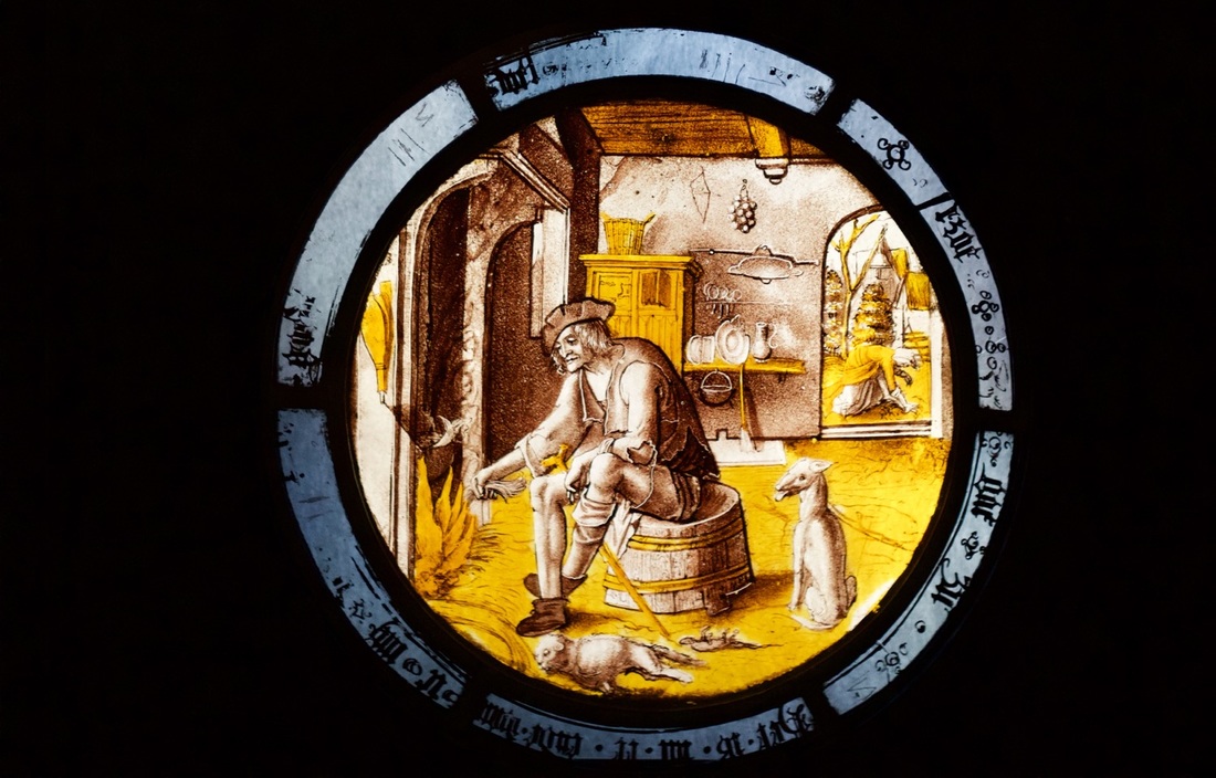
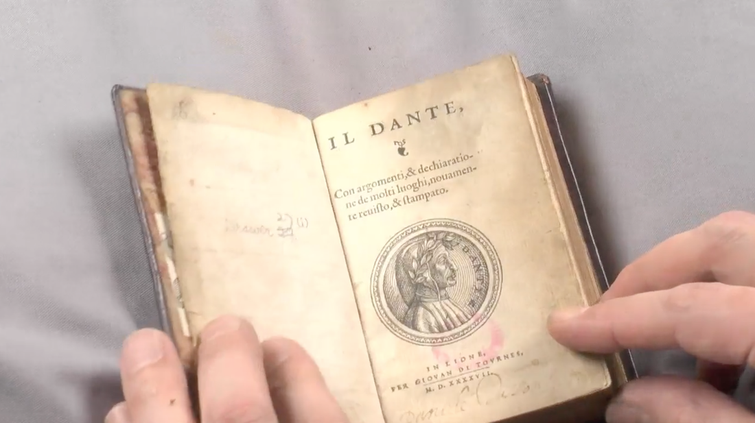
I grew up in suburban London and when I left at the age of 18 I said I never wanted to come back to live here, but I moved into North Kensington in 2004 and we both moved onto Silchester in 2008 and now I’m proud to call myself a Londoner. We live in a great city and a wonderful area. I love the diversity in our neighbourhood and I like it that every time I walk out of the door I meet someone I know – we’re a strong community. I work across the road at Latymer Community Church and our Christian faith is at the core of who we are. So it’s really important to us to be involved on the estate and to participate in the things that matter to us all. We want to stand with our friends and neighbours at a time of potential change and stress and at the same time to celebrate all the wonderful things about living on Silchester. Our community event every summer on Waynflete Square is the highlight of the Residents’ Association’s year and for the rest of the year we enjoy watching the seasons change on our very own garden square. On the 18th and 19th June we were blessed with fine weather, a good turnout and some lovely feedback. Here's a choice selection: Cllr Judith Blakeman: "This amazing exhibition demonstrates what the united community of Silchester does and why it is quite wrong for RBKC to destroy all that has been built up over the years. This vibrant and wonderful community can never be rebuilt." Peter Radisic, resident of Frinstead House: "Great work, done so well.” Christopher Carter: “An eye opener - I hope something develops for the local residents.” Edward Daffarn, Grenfell Action Group: “Great tour and lovely estate.” Danny Kiaisumrid: "I was the the original homeless people. That means, home is where the heart is." Ben Wykes Save the community! Nigel Whitbread, architect of Grenfell Tower: "I particularly enjoyed the tour around both estates; the surprise of the hidden gardens and habitat." Marco Picardi, Green Westway: “Great art and videos. Loved the multi layered tour that really captured the local life.” Simon Elmer and Geraldine Dening, Architects for Social Housing: “Wonderful exhibition. Great work with children and to see the community alive on the walls.” Helena Thompson, Spid Theatre Director and her son, Mat: “We loved the exhibition! So much useful information and so well designed. We had fun in the brilliant gardens too.” There is a corridor sized gallery at the V&A that I am forever drawn to. Literally, in the sense that I love sketching here. It's the Sacred Silver & Stained Glass collection in room 83. During my tenure as the museum's community artist in residence, I used stained glass to meditate on contemporary housing issues. Nathaniel Westlake's magisterial panel at the V&A, Vision of Beatrice, inspired an installation and artist film. The Westlake stained glass panel was made for a V&A exhibition in 1864 and was possibly conceived in the house that Westlake had built for him in the heart of North Kensington. The house is still standing at 1-2 Whitchurch Road opposite the Lancaster West estate and embodies the complex history of social change from the extremes of Victorian affluence and poverty to modern day regeneration and gentrification. This listed building would be a multi-millionaires paradise but has been converted into six bedrooms by St Mungo's and is a hostel for those needing support into housing and work. The house was situated just across the road from my artist studio which itself was a former council flat about to be redeveloped into More West. During my residency, I recorded an interview with Terry Bloxham who is a ceramic and glass specialist at the V&A with responsibility for the stained glass collection. I wanted to understand more about the context in which Westlake had made his stained glass panel and Terry quite rightly took me back in time. I was surprised by how the past would resonate so strongly with the way we live today: the forging of nation states; how religion can violently divide and spiritually unite; and the evolving technological and economic context to the making of art. Here is an edited transcript of our coversation: Terry Bloxham: Why Westlake? Why that panel? Constantine Gras: Why that panel? I didn’t know anything about it until I started my V&A Community Artist residency. I’m based in a studio in North Kensington that is part of an estate, the Silchester Estate. It’s part of a new housing development taking place on the estate. In the run up to my residency, I cycled around the borough, looked at listed buildings and I came across a house, just across the road from where my studio is. It’s the house that was built for Nathaniel Westlake. TB: Oh. Who be he? CG: It’s a bit of a juxtaposition from the estates. You suddenly see this listed building that was built in 1863. It was built by his friend and architect, John Francis Bentley, who later went on to design Westminster Cathedral. And they were both converts to Catholicism and collaborated on St Francis of Assisi church on Pottery Lane in North Kensington. But I was interested in this grand looking house near an estate and that's now run as a sort of hostel. It’s had a bit of a checkered history as this area of North Kensington has. Poverty and slums. Now property that is valued in the millions. TB: Where is North Kensington? CG: This part is opposite Latimer Road tube station. TB: I think I know. Basically Notting Hill west. CG: That’s right. TB: I know that neighbourhood. There’s a great reggae shop. Hopefully it’s still there. CG: So that’s how I came across Westlake. As an artist with a studio in the same area, albeit in a different century, I’m very interested in predecessors and making connections with them. And to discover that the V&A museum has a work of art that has a connection to the very streets in which I'm working. I’m also interested in a film that was also made in the local area and this is called Leo The Last. It was made in 1969 by John Boorman on the site of Lancaster West estate just prior to it being built. It’s about an aristocratic person who moves into the area and he gets radicalised by his interaction with the West Indian community. Some memorable imagery in the film involves looking through a telescope and also patterned glass in a pub that distorts the point of view. I suppose at one level, I wanted to explore or create a connection between film making and stained glass. In the sense of camera lenses and glass transmitting light and how they might be used for perception and analysing or documenting the world around you. Using fragments or a diverse range of media that can be pieced together to make a whole new work of art. And one not necessarily made just by the artist, but involving collaboration. Also I feel a little like that aristocratic character in the film. The artist as an outsider who comes into an area and interacts with the community and how this might radicalise either them or the community or not as the case may be. That is the type of thing I’m wanting to do in my community focused project work. I’m hoping to create a Westlake House at the V&A Museum, in addition to making an artist's film. TB: Brilliant. CG: Perhaps you can help me shed some light on Westlake and how and why he came to make this wonderful panel. TB: Westlake in the nineteenth century, is, near enough, the culmination of a movement that we now call the Gothic revival. And the Gothic Revival was a reaction against eighteenth century stuff and we are going to be talking about that as we progress through time. This involved a revision in the theological understanding of Christianity and also the furnishings of Christian churches. And all throughout the gothic revival period, whether you are talking about stained glass or metalworking or textiles, all of the things that were used for church furnishings, they kept harping on, we must do it in the medieval manner. And that’s why you’ve got to understand the medieval manner in order to understand Westlake. That’s why we are starting here in the medieval period. We are looking at thirteenth century glass. CG: Was this being commissioned by the church? TB: Yes. it was church law that you had to have some sort of decorative, figurative work in the church, that illustrated the Saint to whom that church was dedicated. All images in churches were meant to be instructive. People always say it’s bibles for the poor. But that’s sort of an insult, because it’s calling them illiterate. And I prefer to look at it, not as an age of illiteracy, but as an age when you didn’t need to read and write. Only a few people did. In the middle ages, TB: So here we are looking at a panel from the mid thirteenth century showing a scene of King Childebert being chastised by bishop Jermanus or Jermaine. It is telling you a story, an episode from the life of a real king. His name was Childebert. He’s in the middle of the sixth century and was one of the first kings in France. After the collapse of the Roman empire in the West you have all these so called barbarians moving in. You can tell my preferences lie with the so called barbarians. Various tribal groups as they were known: the Goths, the Gauls, the Francs, the Germanys, the Celts. The celts became the Brits. These groups are going to form our nation states. Clovis was one of these Frankish groups and from Frank we get France. This is where Childebert is descended from. In the panel, we have Childebert being chastised by bishop Jermanus, the first bishop of Paris. He is chastising the King because he had just been on a campaign to conquer the Spanish city of Saragossa. The bishop was upset about this because Saragossa was a christian city. Bishop Jermanus forced Childebert to build the first church in Paris as atonement for his sins and this church was dedicated to St Lawrence. This church was being rebuilt in the thirteenth century in the newish Gothic style and it was rededicated to Jermanus who by then had become a saint. CG: Can you tell me about the designs used in stained glass and the process of making? TB: Medieval decorated windows are composed of small, irregularly shaped pieces of coloured and clear glass. The idea was not to have big square panels of glass which they could make, about A4 sheet size. It was to make a sheet of glass, cut it into irregular shapes and move those shapes around to form a picture. And then those shapes are held together by lead. So it became known as a mosaic-type construction. When you think of a Roman mosaic floor, little pieces of tesserae arranged to make a picture shape. And then they are embedded into cement to form a solid picture. It’s the same thing with mosaic glass. The only painting that you have on it are the details that you can see in the hands and the face, the folds in the clothing. That’s just simple blacky-brown iron-based pigment which is fired onto the surface of the glass. Glass when made is clear. But in its molten state you can add colouring agents to it. Cobalt will make blue. Copper will make green and also red. Manganese will make a purply brown. Depending upon the intensity you can get this nice purply-brown robe or flesh colour. That is know as pot metal because you hold the liquid glass into a pot and add the metallic oxide. So you have clear glass and pot metal glass, cut into small irregularly shaped pieces, put together to make a nice, pretty little picture, all held together in this lead framework. And whatever paint you have was just an iron based pigment onto the surface of the glass to give you your details. That is mosaic glass made in the medieval manner. That is what Westlake is trying to achieve. I have to introduce another element in the manufacturing of medieval glass. Something that was a big technological revolution. I mentioned earlier that properly speaking, it’s not stained glass, it’s decorated glass. And the reason why I say that is because stained means penetration of glass or staining glass. That doesn’t happen until the magic year of about 1300, probably in Normandy. Some bright spark discovered that putting silver into oxide of some form and then firing, what it did was to penetrate the upper levels of the glass and create this lovely lemony yellow to a burnt orange colour. And the reason why that was so revolutionary was it enabled you to have more than one colour on the sheet of glass. We looked at yellow glass and red glass and blue glass and green glass that is known as pot metal glass. That is clear glass that has been coloured. Coloured glass is more expensive than clear glass. Any time you have extra processes it’s going to increase the price. We do have those few surviving documents that give us prices for the middle ages. So we know that glass coloured all the way through was more expensive. Staining it is incredibly cheap to make relative to the older way and once it comes in, it doesn’t disappear. When we get to the Reformation in the sixteenth century, Europe is torn apart by different believers or practitioners of the Christian faith. In the middle ages, remember there is only the church. There is no protestant, no catholic. It is just the church. So you have to put yourself in a time when your world, your faith is being torn apart, is being questioned by people who are very learned and very persuasive. And in some cases also inciters of violent activities and feelings. We tend to blame the whole reformation on him, Martin Luther. He was pretty moderate. You also had people like Calvin and Zinger who were the militant side of the reformation. And there was a lot of destruction and a lot of change. But in Europe today, you will still find this part of Germany is Catholic, but that part is Protestant. But fortunately not fighting each other. England’s story is different and was more violent. Not so much people killing each other, but people destroying anything suggestive of religious imagery. CG: You get a snapshot of those times at the recent iconoclasm exhibition at the Tate. TB: Yes that was a good snapshot. And we also have documents from stain glass makers, petitioning the local leaders of the city, the principalities. Saying you are putting us out of business. We used to make a living making religious windows for churches and it was just no longer allowed. On the continent they started to turn their hands to other iconographic subject matter in stain glass making. TB: What we are looking at now are products of Netherlandish workshops who mastered from the fifteenth century onwards, the art of very fine, but mass and cheap production of glass windows. These are simple pieces of cylinder glass, cut into a circular shape and solely painted. So its clear glass, in silver stain and black pigment. They are cheap. They are incredibly finely painted because this is the age of the printing press. So engravings were made and then they would be printed and they would be used as models for these stained glass workshops. So infect they’re copying exiting art works, unlike in the medieval period where they don’t have the benefit of mass produced engravings and stuff to copy. This panel is the story of Sorgheloos which is a secular version of the old testament story of the prodigal son. This guy, Sorgheloos, goes out, he inherits a whole bunch of money, spends it on wine, women and song. And in the end, all he has left is an old woman, two starving animals and a bunch of straw to eat. So unlike the prodigal son he’s not welcome back with the fatted calf. What also happens in the middle of the sixteenth century, these chemists as we would call them today, alchemists as they were known, developed more pigments that could be fired successfully into glass. In the medieval period it was just that blacky-brown iron based pigment. Now we have enamel colours. So we have the greens and all the shades. Red and all the shades. Blue and all the shades. And the yellows. CG: It must have been a wonder to behold, a sort of technicolour movie. TB: Yes it was. That’s why they were popular. Also coloured glass was expensive and enamel paints are cheaper than coloured glass. So we are now in the age of just simply painting on glass. Think of it as a transparent canvas. Because that is where we are going, painting on glass. Let us jump forward to the middle of the eighteenth century. We have aristocrats interested in the gothic. Walpole made Strawberry Hill which was his idea of Gothic. And then In the early part of the nineteenth century we start getting academics in Oxford known as the Oxford movement. They were also called the Tractarians because they produced a lot of tracts. They are looking at medieval theology and seeing it or pre-reformation theology as a more pure form of the Christian faith. They are not advocating a return to catholicism but they are advocating breaking away from the corruption that crept into the English church in the eighteenth century. Shortly after, a complimentary, although at times, rival group, grows up in Cambridge known as the Cambridge Camden society, but also known as the Ecclesiastics when they are sitting in London. They were interested in pre-reformation theology, but more importantly in pre-reformation architecture and church furnishings. So you have in Oxford, the academics looking at theology. In Cambridge, they are looking at the physical structures of the furnishings. So we are at the beginning of the nineteenth century at that time when people are looking back to the medieval world and things done in the medieval manner. So this is where the Gothic Revival begins. Also in 1824 the Government passes what became known as the 600 churches act. Christianity had fallen into corruption in the eighteenth century. The church fabric itself, the buildings were neglected. There were a lot of people assigned as clerics in churches who just stayed in their country estates and took the money and they didn’t even maintain the churches. So the government steps in and makes a proclamation, effectively going, thou must build churches. Into this comes the great architects like Butterfield, Street, Pugin. So the very first half of the nineteenth century is what we know as the Gothic Revival. Church building, church furnishing going on and stained glass starts apace. Also in the 1850s and 60s craftsmen were thinking why can't we do it like the medieval stained glass makers. They couldn't simply because medieval glass is mouth blown. So there is no evenness in its thickness. Each bit of glass that the medieval craftsman made, this bit is thin at one end, but it might be thicker at the other. So that when you put it into a window and light comes through that little bit of glass, the light will come through differently. It will be less bright in the thicker bit and more bright in the thinner bit. The medieval craftsmen knew that. That's what the Victorian stained glass makers were really trying to discover. TB: Nathaniel Westlake was a freelance designer. You could make a living by doing that. He went around to companies like Powell’s who were probably the biggest manufacturer of windows at this time. He would show his portfolio of how good an artist he was. Also a portfolio of stained glass design that he could offer to them. And that is how he was making his living. But in about 1858-59, clearly by 1860, he had become involved with the stained glass firm of Lavers and Barraud. In 1864 the V&A had an exhibition of stained glass and mosaics and one of the firms that submits things that were selected to be displayed was a panel made by Lavers and Barraud to the design by Nathaniel Westlake. So this is just made for an exhibition piece as far as anyone has ever been able to find out. It wasn’t actually a potential commission which a lot of exhibition pieces were. This just seems to be solely their own making and as it’s a design by Westlake, one makes that big assumption that it’s Westlake’s idea. The iconography of this panel was all in his head. We know that Westlake was friends with the Pre-Raphaelite brotherhood. The Pre-Raphaelite brotherhood like many groups in Europe were interested in things medieval. They’re looking at more literary subjects. Morris and co were doing lots of things like George and the Dragon windows. Dante Alligheri, the writer of the famous Divine Comedy, from the early part of fourteenth century was big. There was a lot of interest in him. The iconography of the Westlake panel is quite complicated. It is derived from Dante’s Divine Comedy. In this poem Dante was granted a trip through hell into purgatory and finally into paradise. It’s a wonderful story. Dante is lead by the Roman poet Virgil who to him represents reason and as Dante is going through hell and purgatory he is reflecting on his own life. He is working out his own sin. At the very end of purgatory, this person called Beatrice starts to be mentioned. Beatrice was a real person, Beatrice Portinali. It seems that Dante knew her when they were children in Florence. He was a member of one family and she was another. For whatever reason and remember Italy wasn’t a unified country, it was a bunch of city states and these city states had noble families fighting each other. So marriages were not love matches, they were political matches and Dante had fallen in love with this young Beatrice. Madly, head over heels, quite perversely. Like, get over it Dante. But he never did. But he couldn’t marry her. She married someone else. We don’t even know if she realized his devotion. But anyway she had to marry someone else and she died quite young. So he was stuck on her all this time. Now when you read the Divine Comedy it becomes apparent that Beatrice is divine love. And divine love is the only way you can go through heaven. Reason cannot take you into heaven. So at the very end of purgatory, before he makes that last crossing of the river and going up into heaven, Dante is given a vision by a woman called Mathilda and her companions, often known as the three graces, but really faith, hope and love. They give Dante a vision of what is to come. And this is the first time that he realised that this woman, who he has always loved and is now dead, has become divine love. This vision of Beatrice is going to lead him into paradise. This is what is depicted in the panel designed by Westlake. Beatrice up there in that top left corner. Faith, hope and love are those three figures who are often referred to as the three graces. First personified in that form by Sandro Botticelli in the middle of the fifteenth century in the Primaevera painting. This is Dante kneeling at the front, eyes closed, given that vision of Beatrice. That moment when he realises that his love has become divine love and so will take him into heaven. It’s done in the medieval manner. So we’ve got little pieces of glass just like in the medieval way, irregular shaped pieces carefully chosen. It’s not just take that one, put it there to make the picture, but trying to get the right balance of light coming through. By this time in the nineteenth century they are using the equivalent of light cables. So they can start to see the effect and so they can choose the glass, arrange the shape in order to maximise the light coming through. So Westlake is the culmination of this late eighteenth century, first half of the nineteenth century, Gothic revival way of doing it in the medieval manner. He is a medieval craftsman. He is a medieval artist. Let’s put it that way. Lavers and Barraud are a workshop that operated in the same way as a medieval workshop would have done. You have a centre in which you had your designer, your painter, your glass maker, your lead worker, all in one institution producing the window and each one being prized for their skills. As the nineteenth century moves on the designer becomes more of an artist. You start to get into, what is known in the ceramic world, as art pottery. You might as well call it art stained glass. Four film stills from Vision of Paradise, 2015. 30 minute, high definition video.
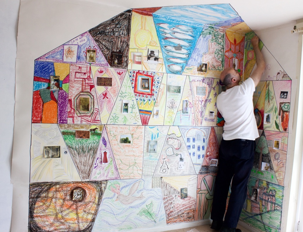
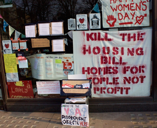
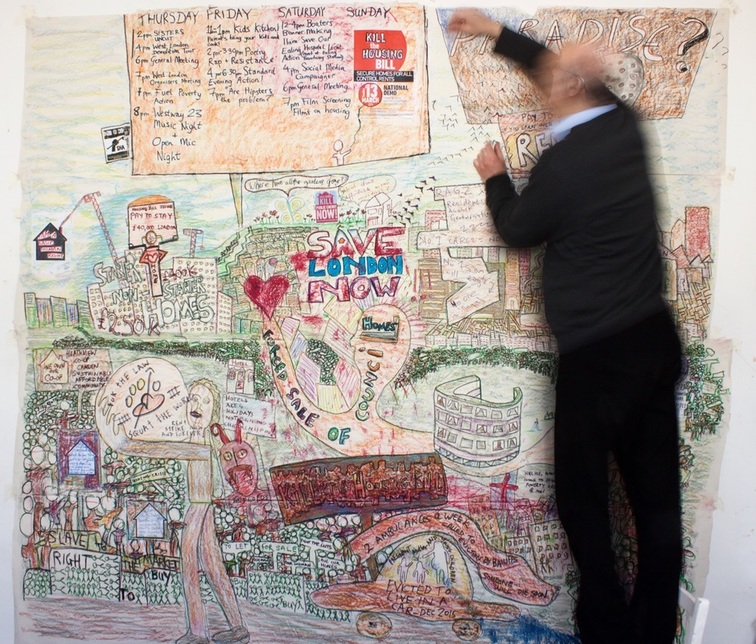
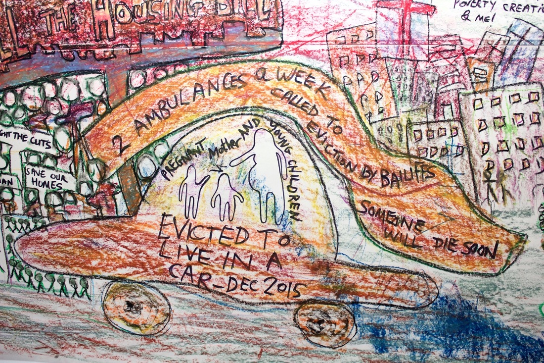
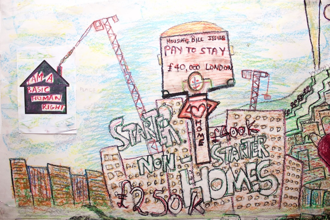
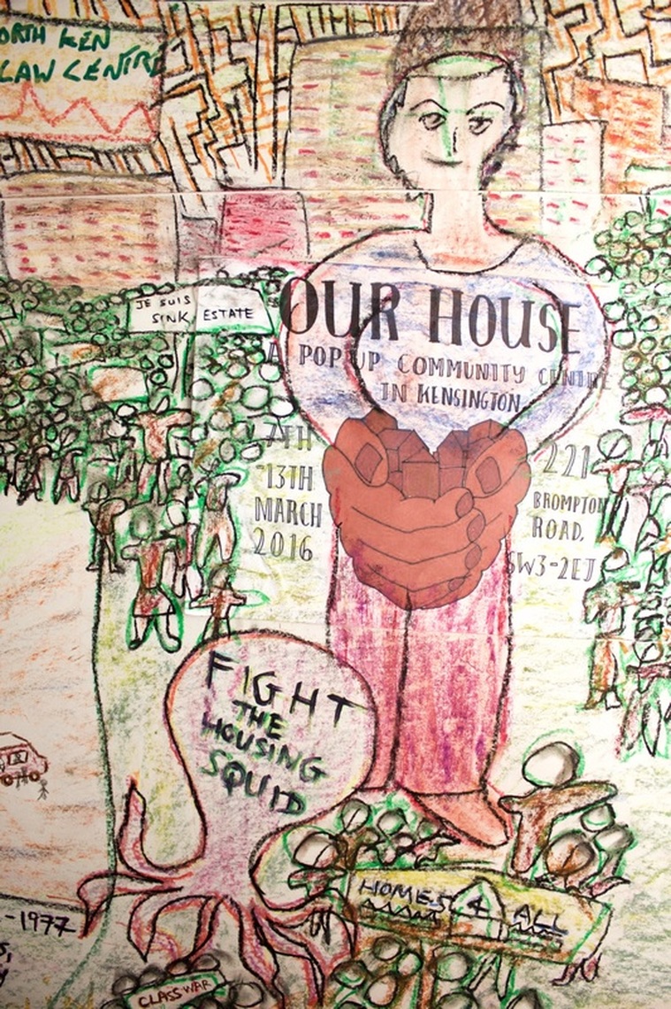
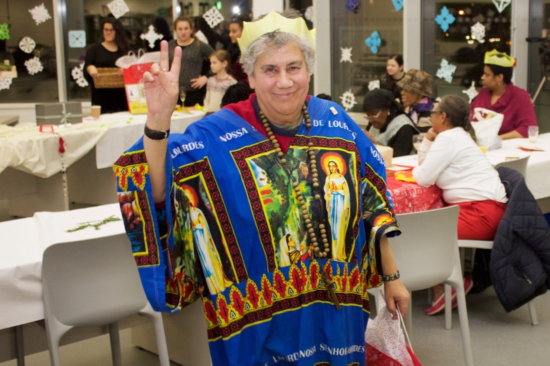
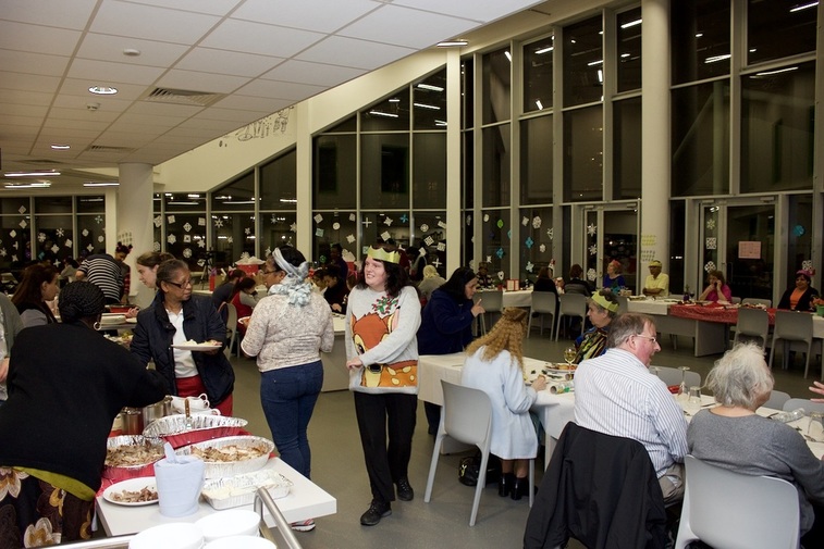
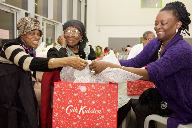
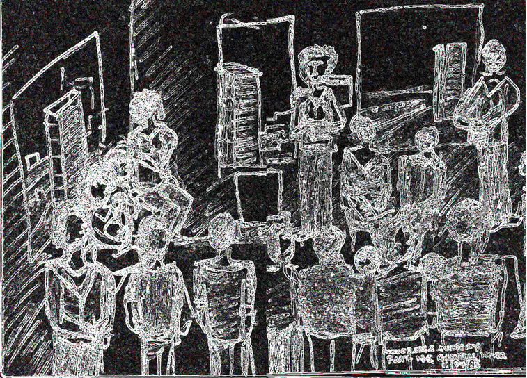
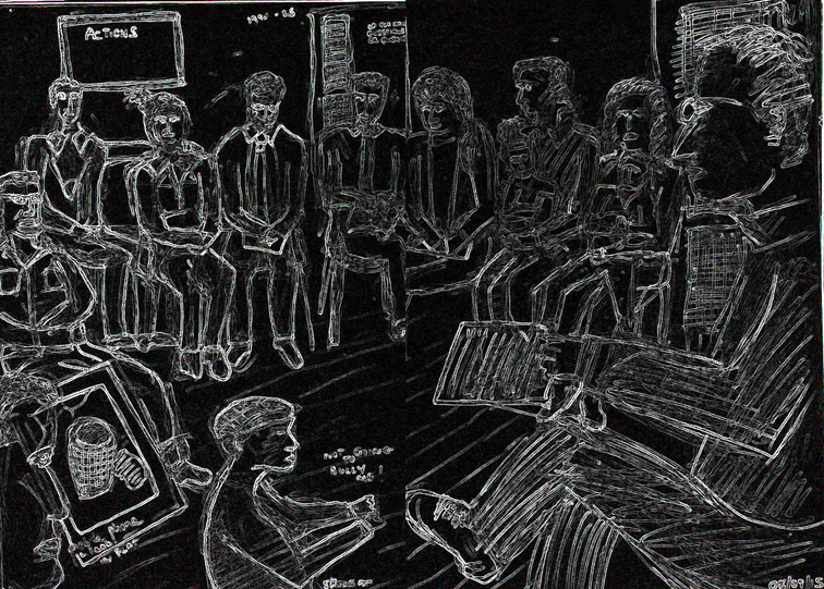
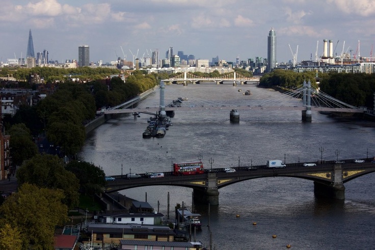
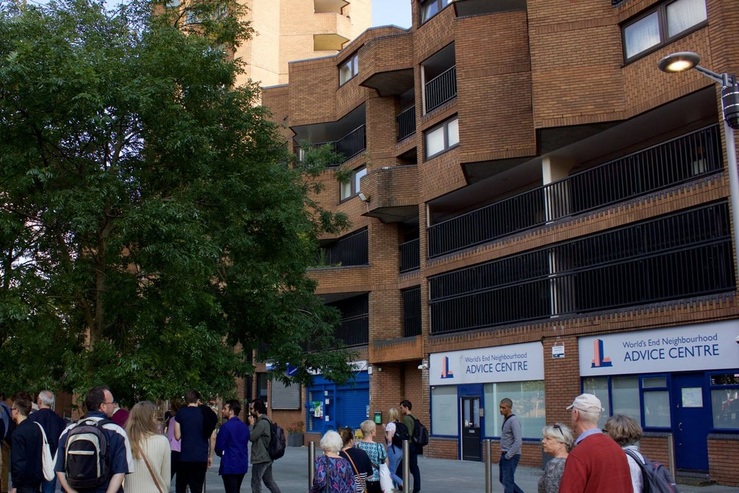
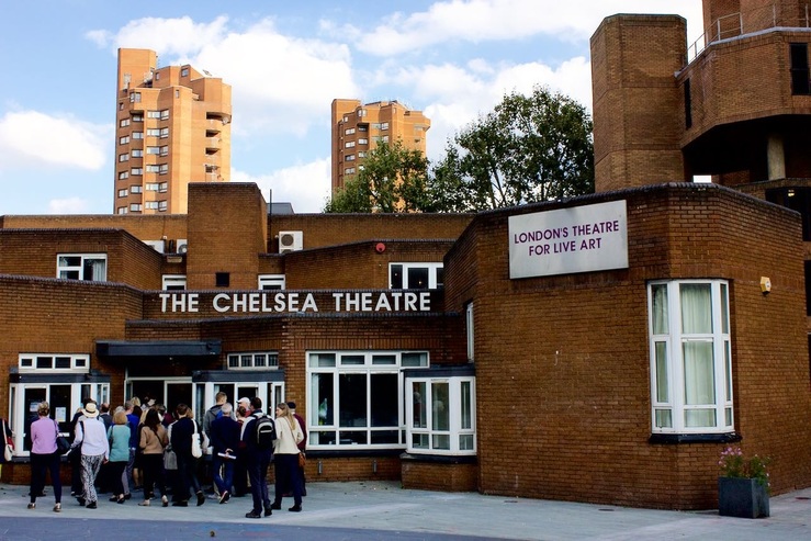
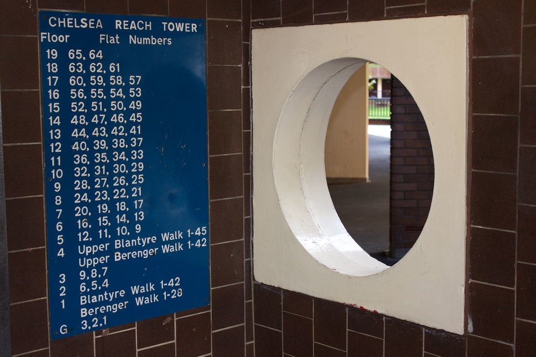
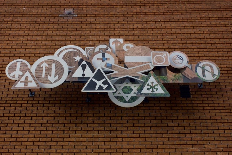
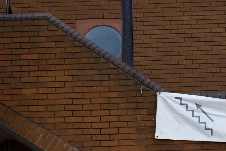
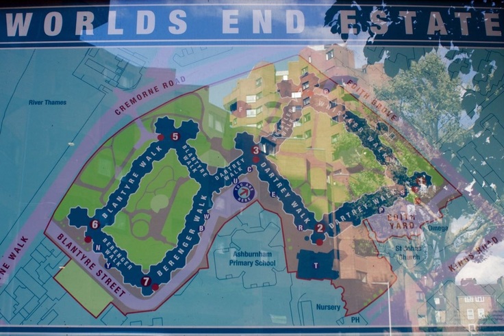
I am a basic human right The Radical Housing Network recently set up a squat and pop up community space ahead of the national demonstration march against the Housing and Planning Bill that was held on the 13th March 2016. In response to these issues, I started a large scale drawing. It began very quietly by allowing others to interact and collaborate. The first mark was made by Edward Daffarn from Grenfell Action Group who described the issues facing the tower block he lives on at Lancaster West estate. This was followed by Colin Stone, a film maker, who made a delicate sketch of the concrete building in Hulme that he lived on as a child: "home to rise rises, poverty, creativity and me." A student from Germany registered her incredulity over the phenomenon of poor doors - a separate entrance in a housing block for those living in less expensive apartments. A toddler wandered over and struggling to differentiate the tip from the base of a crayon, made furtive stabbing motions on the surface of the paper. He eventually made a mark. The child's mother who lives in Camden at a housing co-op called Heathview was more celebratory in describing her home: "sustainable, affordable and community." The drawing was in motion. I provided more detail and joined-up colours. We had started a visual debate into the current housing crisis and the government's lamentable response in building affordable homes. How do artists and the community visualise these complex but fundamental social issues and create campaigning art work? Fight the housing squid I've almost concluded my artist residency at Lancaster West estate. There has been a hiatus to the community project work that has consisted of making large scale drawings for a mural and a short film. The regeneration works on Grenfell tower has entered its final phase and we are also in the festive season when even self-employed artists might be afforded a break. However it was a pleasure to be invited back onto the estate by residents and I attended two contrasting events in December. The first was the Christmas meal for seniors. This was held at Aldridge Academy that has recently been built on the former green of the estate. The meal, drinks and raffle went down exceedingly well. This was the first event organised by the new resident association under the guidance of Clare Dewing and Andrea Newton. I had a chance to film residents and chat to them about the estate and how this area of North Kensington has changed. June Toma: "We've lived here for 34 years and slum clearance in the 6os and 70s has changed it a lot. It's a very multi-cultural area which is lovely. A community is what you make. If you have good neighbours and you're friendly with your neighbours and get on with them - that's important. I think as this generation grows up, it will become more of an up-market area. The housing they are building here is quite expensive. I think it pushes out a lot of young families because they cannot afford to live around here any more." Norman Lewis: "I came here in 1985. The estate has had its ups and downs. But I have very nice neighbours and we are very close. We watch each other's backs. The food today is lovely and its nice to have all the community together." Cllr Judith Blakeman: "Today we are reviving the Lancaster West pensioners christmas dinner. We couldn't have one last year because of the building works. It's always the most fantastic event. The estate is becoming a coherent community partly due to the building works and what residents have gone through. This has really brough residents together. It would be a huge shame if this community was destroyed. The big problem is central government policy towards social housing and that's what's worrying us." The second event was a mediation meeting between residents of Grenfell Tower at Lancaster West estate and the Tenant Management Organisation (TMO) that run the estate. Also in attendance were the local councillor and MP. I have been to several meetings and residents are now comfortable with me ether filming or sketching during the proceedings. Let me give some background information. Grenfell Tower has had a £10 million regeneration with new double glazed windows and heating for each flat; the latter has involved a complicated overhaul of the 1970s boiler system. There has been an upgrade to the exterior cladding of the building. In addition to this, new flats are being created and hopefully providing much needed housing at affordable rents. The nursery and boxing club will both be returning to much improved facilities in the building. Despite all this positive regeneration, there has been a bitter dispute between a large number of residents and the TMO; specifically regarding the location for the new boilers in each property. The newly formed Grenfell compact group that represents residents in the tower has also called for an independent investigation into how the TMO have managed the regeneration. One issue that Lady Victoria Borwick, MP, constantly reiterated during the meeting was the pressing need to set aside differences and for all residents to cooperate with the TMO in getting heating and hot water supplies completed in time for Christmas. Over the past year many residents have refused to let contractors commence work in their flats. This has resulted in some of them being threatened with legal action as the TMO has a responsibility to complete the works. In the run up to Christmas the last few properties were having work done to install new boilers and radiators. As an artist working with the TMO on community engagement it has not been an easy residency. I have hopefully overcome initial skepticism about art being a waste of time and money. I have embedded myself very closely with the community in an attempt to reflect all shades of communal life from vibrant tinsel to more sombre monochrome. So let me raise a slightly chipped glass and propose a toast to Lancaster West; to all residents who live on the estate and all the personnel from the TMO who manage the 1200 properties. I look forward to finalising designs of the mural with residents and to work with the TMO in celebrating the 40th anniversary of Lancaster West next year. World's End Is located between King's Road and the river Thames in South Kensington. It is also the name for the large estate located here. This was built at the same time as Lancaster West estate where I am currently community artist in residence. I thought it useful to pay the sister estate a visit and a recent Open Day afforded that opportunity. The architectural design at World's End is far more striking and successful. It appears to be designed as the original architect, Eric Lyons, had intended. The estate consists of 7 high-rise tower blocks interlinked by 9 low-rise walkways with two internal courtyards. All the buildings merge into each other and create that unified feeling. There are also shops and other facilities built in and around World's End which it's brother in the north is sorely missing. Notable amongst these are a school, church and theatre. Lancaster West had the same "walkways in the sky" aspiration but it's building process was far more complicated and resulted in a more fragmentary outcome. What the estates have in common are the signage. As I've discovered in the archives, the design team of Jock Kinneir and Margaret Calvert were appointed to produce the estate navigation for both Lancaster West and the World's End in the early 1970s. They built upon their classic designs used to revolutionise signage on Britain's motorways. I particularly like the way individual flat numbers at Chelsea Reach Tower are denoted in a tower like grid. Very elegant. It was a pleasant surprise to come across a public art work that seemed to unconciously reference this design history. Set high up on a sheer brick facade, was a series of signs, capturing the receding light of the day and providing reflective glimpses back in time as well as into the future. They seemed to be quizzical pointing in various, complicated directions. How do you make a home in the rich city? How do you find your bearings in communal life? What is the role of art? |
Categories
All
Archives
May 2024
|




 RSS Feed
